Affresco
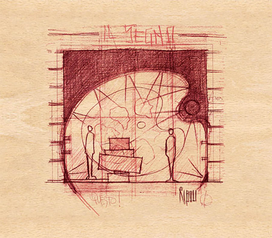
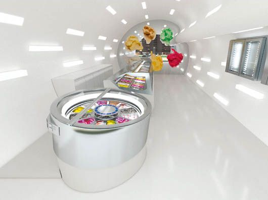
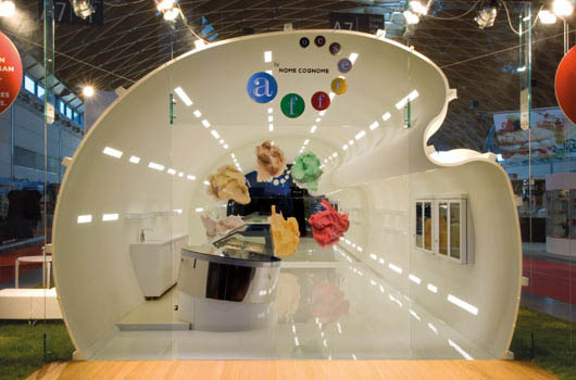
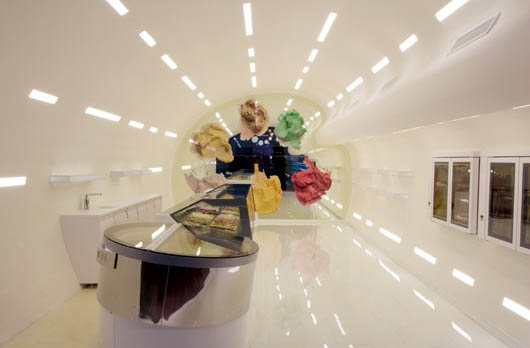
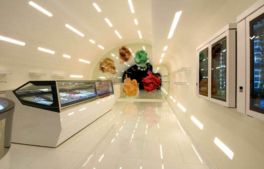
Fresco is a concept designed by Beppe Riboli. One dream space, curves and sinuous lines, smoothness, the feeling of being in an art gallery, where the works are ice cream.
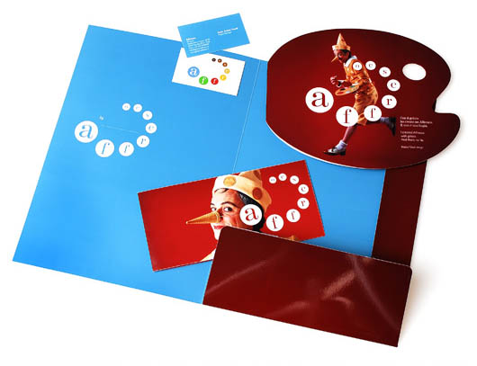
The project Fresco uses, for creating corporate identity and communication campaign, creativity and art direction of Marco Morosini (Studio Marco Morosini), in collaboration with the ‘Workshop of copywriting’ Marco Livi.
The name Fresco instantly recalls the painting technique known, with a direct connection to the main design concept, the palette and art. The word also contains the word “fresh”, conveying the feeling of wellbeing you feel when you eat ice cream, of course fresh.
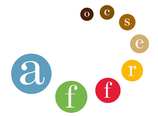
The logo recalls the colors arranged on the palette, with an exciting and dynamic design. The main aspect is the roundness, circularity, along with the energy of the colors. We investigated the circular shape of the ice cream cone and balls, stylized spiral design allows installation in the middle the name of the ice cream maker, starring with his homemade ice cream.
The Morosini Studio has also designed all the elements coordinated, as the official uniform (where returns, polka dots, the pattern of balls of ice cream) and the recipe book.
The launch campaign concept of communication and support tools is focused on the character of Pinocchio, Italian symbol, which immediately brings the fun aspect, of sympathy and pleasure connected to the ice cream. In the role of Pinocchio, the designer Beppe Riboli photographed by Marco Morosini with ice cream, Riboli-Pinocchio created a Fresco. It is not a lie!